گلزار
نستعلیق اردو فونٹ
Download Gulzar
Gulzar is a libre (free of charge, and freely redistributable) font, licensed under the SIL Open Font License, Version 1.1.
تنقیدی جائزہ
زہرا نگاہ کے کلام میں روزمرہ کی زندگی کے جذباتی معاملات ہیں، جنہیں زہرا صنف نازک کی شاعری کہتی ہیں۔ جیسے ملائم گرم سمجھوتے کی چادر، قصیدہ بہار، نیا گھر، علی اور نعمان کے نام، سیاسی واقعات کے تاثرات بھی، وہ وعدہ بھی جو انسانوں کی تقدیروں میں لکھا ہے اور محض تغزل بھی۔ ان منظومات میں نہ جدیدیت کے غیر شاعرانہ جذبات کا کوئی پرتو ہے اور نہ رومانویت کی شاعرانہ آرائش پسندی کا کوئی دخل ہے۔ روایتی نقش و نگار اور آرائشی رنگ و روغن کا سہارا لیے بغیر شعر کہنا زہرا نگاہ کے شعری اسلوب کا خاصا ہے۔ تشبیہ و استعارے سے عاری ایک آدھ بلیغ مصرع جس سے پوری نظم کا سراپا جھلملانے لگے، اس کی سب سے اچھی مثال زہرا کی نظم شام کا پہلا تارا ہے۔ ان کی تخلیقات میں شام کا پہلا تارا ، ورق اور فراق شامل ہیں۔
Type Tester
نستعلیق (نسخ اور تعلیق کا مرکب) یا خط فارسی فن خطاطی کا ایک اہم، مشہور اور خوب صورت ترین خط ہے جس میں عموماً فارسی-عربی حروف تہجی استعمال کرنے والی زبانیں لکھی جاتی ہیں۔
EN ار
Gulzar: a contemporary Urdu Nasta’liq typeface
گلزار: جدید نستعلیق فونٹ
Borna Izadpanah
برنا ایزدپناه
This project began at the end of 2019 when I was commissioned by Google to design an original Urdu Nasta’liq typeface. Since it was beyond my capabilities to embark on this task independently, Fiona Ross and Simon Cozens were invited to join the project as consultant and font engineer respectively. The Latin typeface was designed by Alice Savoie as a harmonious counterpart to the Nasta'liq. The background and design process is described below.
اس منصوبے کا آغاز ۲۰۱۹ کے آخر میں ہوا جب گُوگل نے مجھے اردو نستعلیق کا ایک طبع زاد ٹائپ فیس ڈیزائن کرنے کا کام دیا تھا۔ چونکہ اِس کام کو اکیلے کرنا میری صلاحیتوں سے بالاتر تھا، اس لیے میں نے فیونا راس کو بطور کنسلٹنٹ اور سائمن کزنز کو بطور فونٹ انجینئر اس پروجیکٹ میں شرکت کرنے کی دعوت دی۔ نستعلیق سے مطابقت رکھنے والا متعلقہ لاطینی ٹائپ فیس ایلس سیووئی نے ڈیزائن کیا۔ ذیل میں اس پروجیکٹ کا پس منظر اور اس کے ڈیزائن کا عمل بیان کیا جاتا ہے۔
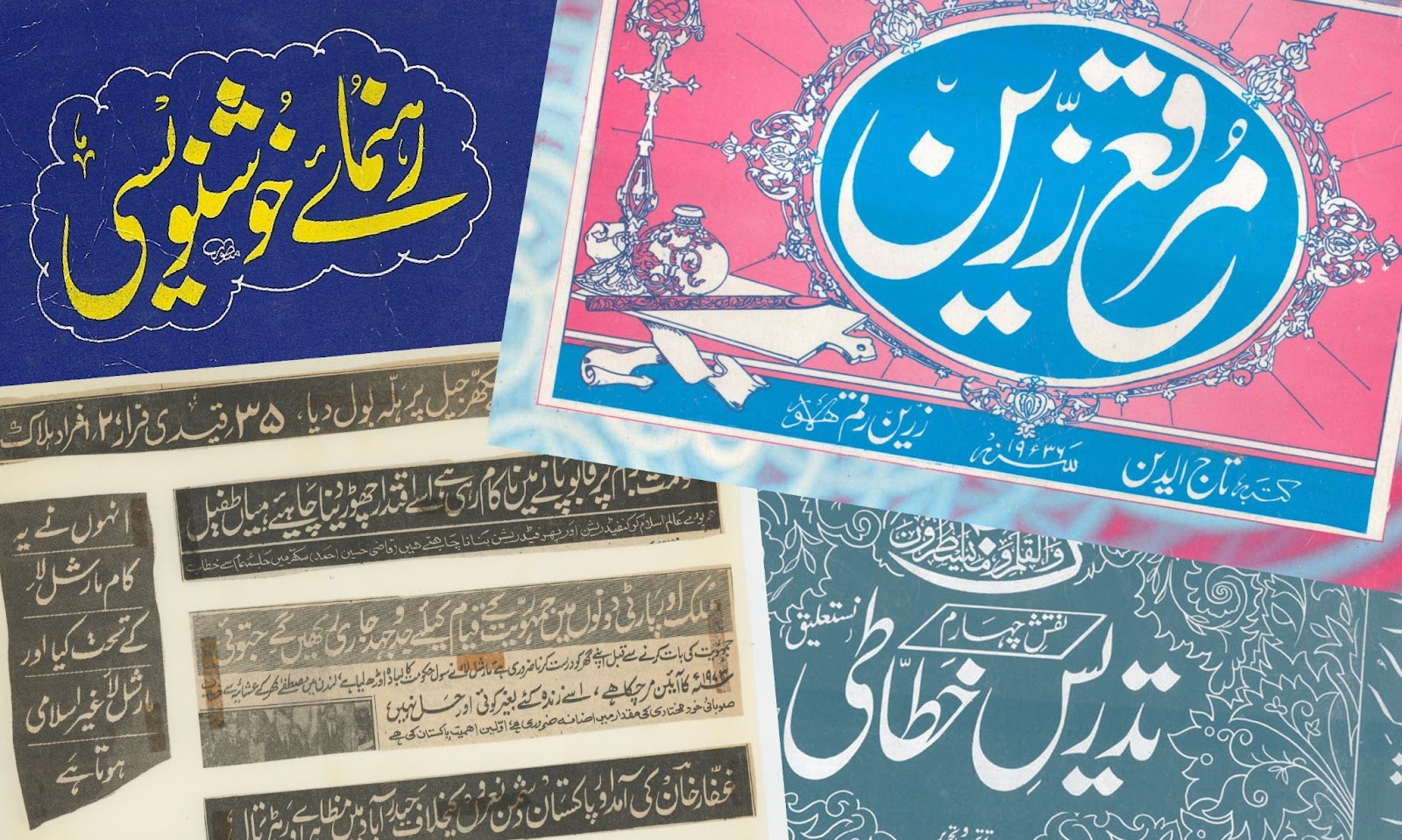
Fig 1. Various Urdu Nasta’liq calligraphy and lettering specimens
تصویر ۱۔ اردو نستعلیق میں خطاطی اور لیٹرنگ کے چند نمونے۔
Background
پس منظر
The first phase of this project involved conducting research into the history of Urdu digital typefaces from the early 1980s. This built on research already conducted for an MA dissertation at the University of Reading, The typographic development of the Nasta’liq style, by Borna Izadpanah (2015). This work included the analysis of some of the early and noteworthy Urdu Nastaliq digital typeface projects, including Monotype’s Noori Nastaliq (1981), by Ahmed Mirza Jamil and Monotype Corporation; Linotype’s Sheeraz (1986-7) and Qalmi (1994), by Mike Fellows, Tim Holloway and Fiona Ross; DecoType Nastaliq (2010) and Nastaleeq Press (2013), by Thomas Milo and Mirjam Somers. Each of these pioneering typefaces offered solutions for typesetting with Urdu Nasta’liq; however, since none of these typefaces were originally developed as an OpenType font, their application required the use of specifically designed software, and largely remained limited to particular technological environments.
پروجیکٹ کے پہلے مرحلے میں اردو کے اُن ڈیجیٹل فونٹس کی تاریخ پر تحقیق کی گئی جو ۱۹۸۰ کے اوائل میں بنائے گئے تھے۔ یہ تحقیق چند سال قبل کی جانے والی اُس تحقیق پر مبنی تھی جو یونیورسٹی آف ریڈنگ میں برنا ایزدپناه کے ایم-اے کے مقالے، ”خطِ نستعلیق کی ٹائپوگرافی کا ارتقا (۲۰۱۵)“، کے لیے کی گئی تھی۔ اس مقالے میں اردو نستعلیق کے چند ابتدائی اور قابلِ ذکر ڈیجیٹل ٹائپ فیس منصوبوں کا تجزیہ کیا گیا تھا، جن میں مونوٹائپ کا نوری نستعلیق (۱۹۸۱)، از احمد مرزا جمیل اور مونوٹائپ کارپوریشن؛ لائنوٹائپ کے شیراز (۱۹۸۶-۷) اور قلمی (۱۹۹۴)، از مائیک فیلوز، ٹِم ہالووے اور فیونا راس؛ اور ڈیکوٹائپ نستعلیق (۲۰۱۰) اور نستعلیق پریس (۲۰۱۳)، از تھامس میلو اور مریم سومرز شامل تھے۔ اِن تمام ٹائپ فیسز نے اردو نستعلیق کی ٹائپسیٹنگ کے لیے اچھوتے حل پیش کیے؛ تاہم، چونکہ اِن میں سے کوئی بھی ٹائپ فیس اوپن ٹائپ فونٹ کے طور پر تیار نہیں کیا گیا تھا، اس لیے اِن سب کے لیے خصوصی سوفٹویئر ڈیزائن کرنے کی ضرورت پیش آئی، اور اِن کا استعمال بڑی حد تک اِن کے مخصوص تکنیکی ماحول تک ہی محدود رہا۔
More recently a number of OpenType Nasta’liq typefaces have been designed in Iran, Pakistan and Europe which have made valuable advances in Nasta’liq typography. Some of the notable examples include Iran Nastaliq designed by Hossein Zahedi following the calligraphy of Amir Ahmad Falsafi (2007–08); Noto Nastaliq Urdu by Patrick Giasson and Kamal Mansour (2014); Mehr Nastaliq Web by Muhammad Zeeshan Nasar following the calligraphy of Nasrullah Mehr (2017).
حال ہی میں ایران، پاکستان اور یورپ میں نستعلیق کے متعدد اوپن ٹائپ فونٹس ڈیزائن کیے گئے ہیں جنہوں نے نستعلیق ٹائپوگرافی میں گرانقدر پیشرفت کی ہے۔ چند قابلِ ذکر مثالوں میں امیر احمد فلسفی کی خطاطی پر مبنی ایران نستعلیق، از حسین زاهدی (۲۰۰۷)؛ نوٹو نستعلیق اردو، از پیٹرک گیاسن اور کمال منصور (۲۰۱۴)؛ اور نصر اللہ مہر کی خطاطی پر مبنی مہر نستعلیق ویب، از محمد ذیشان نصر (۲۰۱۷) شامل ہیں۔
The design
ڈیزائن
The design of Gulzar was inspired by carefully collected specimens of Urdu calligraphy and lettering which were closely studied to achieve an accurate representation of the Urdu flavour of the Nasta’liq style (Fig 2).
گلزار کے ڈیزائن کے لیے اردو خطاطی اور لیٹرنگ کے منتخب نمونوں سے تحریک لی گئی، اور نستعلیق کے اردو انداز (تصویر ۲) کی درست ترجمانی کرنے کے لیے ان نمونوں کا بغور مطالعہ کیا گیا۔
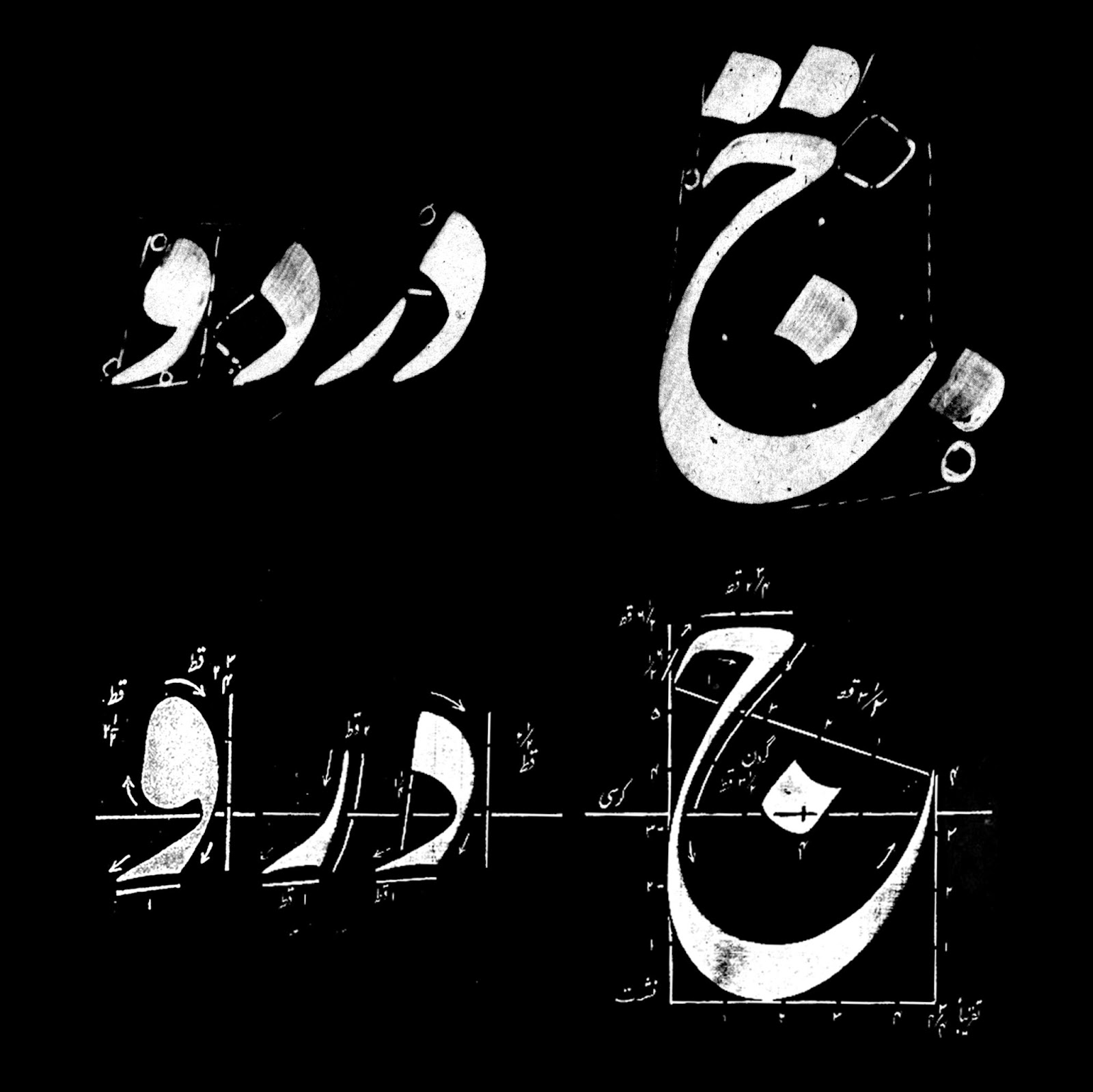
Fig 2. Note the structural differences between the Persian (top) and Urdu (bottom) flavours of the Nasta’liq style.
تصویر ۲۔ نستعلیق کے فارسی (اوپر) اور اردو (نیچے) انداز میں بناوٹ کے فرق کو دیکھیے۔
The models however were not merely traced and digitised, but they were used as an inspiration to design a typeface with a contemporary feel. Thus Gulzar was designed typographically rather than calligraphically. This is particularly evident in the treatment of terminals which were designed to look clear and consistent on different platforms and in different sizes (Fig 3).
البتہ ان نمونوں کو محض ٹریس کر کے ڈیجیٹائز نہیں کر لیا گیا، بلکہ ان سے ایک جدید ٹائپ فیس وضع کرنے کی تحریک حاصل کی گئی، تاکہ گلزار کو خطاطی کے بجائے ٹائپوگرافی کے لحاظ سے ڈیزائن کیا جا سکے۔ یہ خاص طور پر ٹرمینلز کے برتاؤ میں واضح ہے جنہیں مختلف پلیٹفارمز اور مختلف حجم میں واضح اور یکساں نظر آنے کے لیے ڈیزائن کیا گیا (تصویر ۳)۔
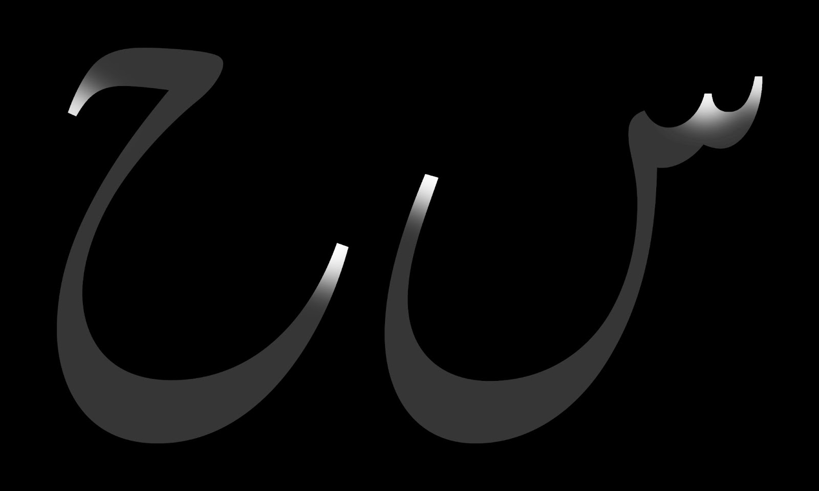
Fig 3. Note the sharply cut terminals.
تصویر ۳۔ کاٹے گئے ٹرمینلز کو دیکھیے۔
After collecting the most suitable models for the letterforms, Amir Mahdi Moslehi, an Iranian designer and calligrapher, was asked to produce initial calligraphic patterns which would ensure the consistency of the stroke modulation that is crucial to Nasta’liq. In this style, calligraphers use different sections of the nib of the reed pen and frequently rotate the pen to shape the Nasta’liq letterforms (Fig 4). This is carefully controlled to produce the balance of the letterforms and the distribution of the thick and thin strokes.
حروف کی اشکال کے لیے موزوں ترین ماڈل جمع کرنے کے بعد ایرانی ڈیزائنر اور خطاط، امیر مهدی مصلحی، سے کہا گیا کہ وہ خطاطی کے ابتدائی نمونے تیار کریں۔ ان نمونوں کا مقصد اس بات کو یقینی بنانا تھا کہ نستعلیق کی تمام اشکال کا زیر و بم یکساں رہے۔ نستعلیق طرز میں خطاط قلم کی نوک کے مختلف حصوں کو استعمال کرتے ہیں اور قلم کو مسلسل گھماتے ہوئے حروف کی اشکال بناتے ہیں۔ قلم کی روش کو احتیاط سے قابو میں رکھا جاتا ہے تاکہ حروف کی اشکال اور ان کے موٹے اور باریک حصوں میں توازن برقرار رہے۔
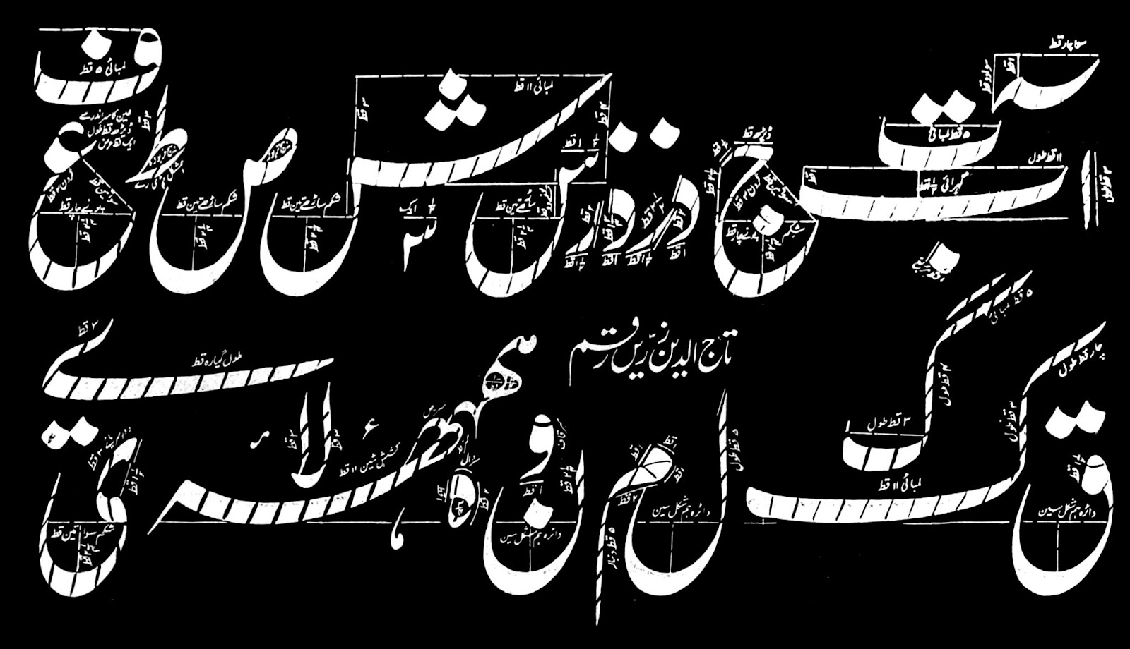
Fig 4. This illustration shows the angle of the reed pen in writing different parts of each letterform.
تصویر ۴۔ اِس نقش میں حروف کے مختلف حصوں کی لکھائی کے دوران قلم کے زاویے کو واضح کیا گیا ہے۔
The first sketches that Amir provided were not satisfactory since they clearly showed the Persian calligraphic sensibilities which were not in accordance with the collected Urdu models. The important and distinctive characteristics of the Urdu models were indicated to Amir, and based on this brief, he produced patterns that were much more consistent with the provided models. However, it became apparent that there were still important characteristics of Urdu Nasta’liq which were not correctly implemented, and thus only a few of these new patterns, with some alteration, were adopted. The design process therefore necessitated several rounds of drawing of almost every glyph in Gulzar, until it reached the desired quality in digital form. In this process, each version was extensively tested and reviewed to ensure the quality of the design.
امیر کے بنائے ہوئے ابتدائی خاکے اطمینان بخش نہیں تھے کیونکہ ان میں واضح طور پر فارسی طرز کا اثر موجود تھا، جو ہمارے جمع کیے گئے اردو نمونوں کے برعکس تھا۔ چنانچہ امیر کو اردو ماڈلز کی اہم اور امتیازی خصوصیات کے بارے میں آگاہ کیا گیا، جس کی بنیاد پر انہوں نے نئے خاکے تیار کیے جو ہمارے ماڈلز کے کہیں زیادہ قریب تھے۔ البتہ اب بھی ان خاکوں میں اردو نستعلیق کی چند اہم خصوصیات موجود نہ تھیں، اور ان میں سے چند ہی نمونے (کچھ تبدیلیوں کے ساتھ) اختیار کیے گئے۔ یوں ڈیزائن کے دوران گلزار کی تقریباً ہر شکل کے لیے کئی بار ڈرائنگ کی گئی، یہاں تک کہ تمام اشکال کا ڈیزائن اپنی ڈیجیٹل صورت کے مطلوبہ معیار تک پہنچ گیا۔ اس تمام عمل میں ہر مرحلے پر بغور جانچ پڑتال کی گئی تاکہ ڈیزائن کے معیار کو یقینی بنایا جا سکے۔
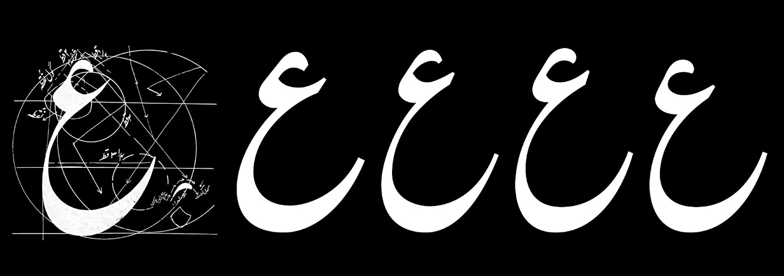
Fig 5. Calligraphic form of the letter ain (left) and several stages of its development to achieve the most appropriate form (from left to right).
تصویر ۵۔ حرف ع کی خطاطی میں شکل (بائیں) ڈرائنگ کے مختلف مراحل سے گزرتے ہوئے (بائیں سے دائیں) تاکہ اس کی موزوں ترین شکل حاصل کی جا سکے۔
One of the most challenging aspects in the design process of Gulzar was to devise the character set (glyphset) required to produce a fully functioning Nastaliq typeface. Initially this was inspired by the approach that was conceived by Mike Fellows, Tim Holloway and Fiona Ross in designing the Linotype Sheeraz and Qalmi typefaces. These were the first Nasta’liq fonts that provided a method in which the letters were stored in their individual forms and composed calligraphically with dots and diacritics in their correct positions. In this system, the letters were broken down into a relatively modest number of forms or characters which were administered by the rules of calligraphy programmed into the software. Therefore, unlike Monotype’s Noori Nastaliq, which was limited to the groups of letters existing in Urdu language, almost any letter combination could be achieved by this approach. Moreover, by designating their “zones of influence”, dots and diacritics could alter their positions to avoid clashes through specific software techniques. This was especially important for the baṛī ye character which occurs frequently in Urdu text. This ability was essential to newspaper typesetting, which often uses foreign words and names that the font should be able to render.
گلزار کے ڈیزائن کے پیچیدہ ترین پہلوؤں میں سے ایک یہ تھا کہ ایک مکمل نستعلیق ٹائپ فیس کے لیے درکار کیریکٹر سیٹ (یا گلفس کے مجموعے) کو کیسے وضع کیا جائے۔ ابتدا میں ہم نے اُس حکمتِ عملی سے استفادہ کیا جو مائیک فیلوز، ٹِم ہالووے اور فیونا راس نے لائنوٹائپ شیراز اور قلمی ٹائپ فیسز کے لیے اختیار کی تھی۔ یہ وہ اولین فونٹس تھے جنہوں نے حروف کی انفرادی اشکال کو علاحدہ محفوظ کیا، اور پھر ان کے اوپر نقطوں اور اعراب کو درست جگہوں پر لگانے کا نظام فراہم کیا۔ اس نظام میں حروف کے متعدد ٹکڑے کیے گئے تھے، اور پھر ان ٹکڑوں کو سوفٹویئر کے اندر خطاطی کے قواعد کے مطابق برتا گیا تھا۔ یوں حروف کی تقریباً ہر ترتیب کو لکھا جا سکتا تھا (مونوٹائپ کے نوری نستعلیق کے برعکس، جو صرف اردو زبان کے الفاظ تک محدود تھا)۔ نیز، نقطے اور اعراب اپنے ”زیرِ اثر حلقوں“ (zones of influence) کی بدولت اپنی جگہیں بھی تبدیل کر سکتے تھے تاکہ دیگر اشکال کے ساتھ ٹکراؤ سے گریز کیا جا سکے۔ یہ خاص طور پر بڑی ے کے لیے اہم تھا جو اردو متن میں کثرت سے استعمال ہوتی ہے۔ یہ صلاحیت اخباروں کی ٹائپسیٹنگ کے لیے بھی ضروری تھی، جن میں اکثر غیرملکی الفاظ اور نام درج ہوتے ہیں اور جن کی درست رینڈرنگ پر فونٹ کو قادر ہونا چاہیے۔
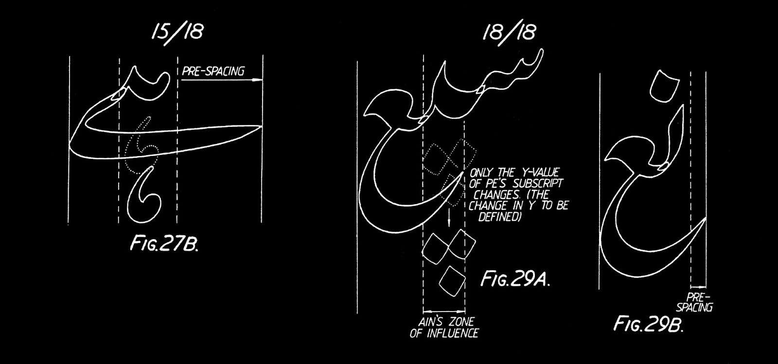
Fig 6. The method of connecting characters and dot positioning in Sheeraz and Qalmi typefaces.
تصویر ۶۔ شیراز اور قلمی فونٹس میں حروف کے جوڑ اور نقاط کی جگہ کے تعین کا طریقہ۔
In Sheeraz and Qalmi, each undotted letter (called rasm in Arabic) consisted of a group of initial, medial, final and unconnected variants and alternatives. Most of the connecting forms, such as those displayed in Fig 6, were designed with entry and exit strokes which would overlap to make the cursive connection. This was further modified in Gulzar; instead of adding both entry and exit strokes, each character has only an exit stroke, specifically designed to match the character following it (Fig 7). Thanks to this approach, the initial forms of letter groups could also be re-used as components in the medial position. This not only reduced the number of glyphs which needed to be designed, but also ensured smooth and seamless connections.
شیراز اور قلمی میں ہر غیر نقطہ دار حرف کے لیے (جسے عربی میں رسم کہا جاتا ہے) ابتدائی، درمیانی، آخری اور اکیلی اشکال کا ایک گروہ موجود تھا۔ دوسروں کے ساتھ جڑنے والی اشکال کو، جیسی تصویر ۶ میں موجود ہیں، اینٹری (entry) اور ایگزِٹ (exit) سڑوکس سمیت ڈیزائن کیا گیا تھا تاکہ جوڑوں میں روانی حاصل ہو۔ گلزار میں اس کو مزید تبدیل کیا گیا؛ اینٹری اور ایگزِٹ سٹروکس دونوں شامل کرنے کے بجائے ہر حرف میں صرف ایگزِٹ سٹروک ہی شامل کیا گیا، اور جسے خاص طور پر اگلے حرف کے ساتھ جڑنے کے لیے ڈیزائن کیا گیا (تصویر ۷)۔ اس طریقے کی بدولت حروف کی ابتدائی اشکال کو درمیانی جگہوں میں بھی استعمال کیا جا سکتا تھا، جس سے نہ صرف گلفس کی تعداد میں کمی آئی، بلکہ جوڑوں کا ہموار ہونا بھی یقینی بنایا گیا۔
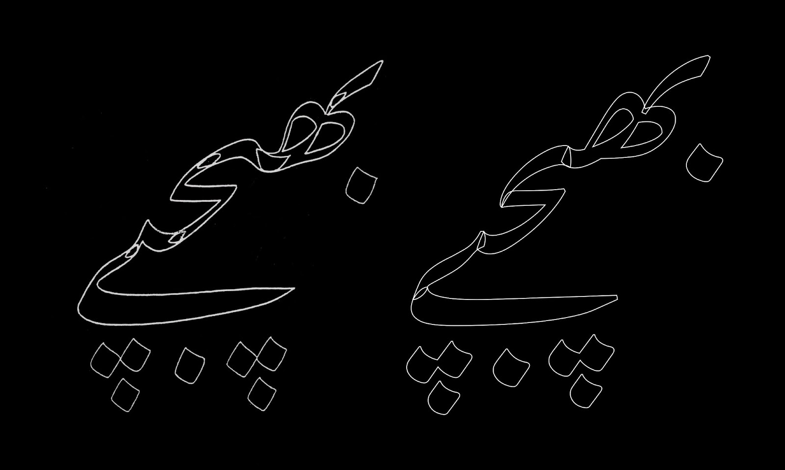
Fig 7. The method of connecting characters in Sheeraz and Qalmi typefaces (left) and in Gulzar (right).
تصویر ۷۔ شیراز اور قلمی فونٹس (بائیں) اور گلزار (دائیں) میں حروف جوڑنے کا طریقہ۔
In Nasta’liq style, depending on the size and application, calligraphers make various modifications in the proportions and stroke thicknesses to achieve the best optical rendition of the letterforms. In a digital typeface, which is supposed to function at different sizes and on different printed or digital platforms, this quality is much more difficult to implement. Ideally a font would include a number of optical axes designed to ensure the delivery of the best effect in different sizes. In Gulzar, the aim has been to produce a typeface which is legible at text sizes and suitable for sustained reading. Therefore, loops and apertures are designed more open to ensure clarity in small sizes.
سائز اور استعمال کی ضروریات کو دیکھتے ہوئے نستعلیق کے خطاط حروف کے تناسب اور موٹائی میں متعدد تبدیلیاں کرتے ہیں تاکہ ان کی بہترین بصری صورت حاصل کی جا سکے۔ ایسے معیار کو ایک ڈیجیٹل ٹائپ فیس میں، جسے متفرق سائز اور متعدد پرنٹ یا ڈیجیٹل پلیٹفارمز میں استعمال ہونا ہو، نافذ کرنا کافی مشکل ہے۔ مثالی صورتحال تو یہ ہو گی کہ مختلف سائزز میں بہترین نتیجہ حاصل کرنے کے لیے فونٹ کے اندر آپٹیکل ایکسِز (optical axes) موجود ہوں۔ گلزار کی صورت میں ہم ایک ایسا ٹائپ فیس تیار کرنا چاہتے ہیں جو ٹیکسٹ سائزز میں آسانی سے پڑھا جا سکے اور مستقل مطالعے کے لیے موزوں ہو۔ لہٰذا، اس کے دائروں اور حلقوں کو کشادہ رکھا گیا ہے تاکہ چھوٹے حجم میں بھی واضح رہیں۔
Latin counterpart
متعلقہ لاطینی ٹائپ فیس
The Latin counterpart was conceived in coherence with Gulzar’s underlying principles, i.e. a typeface that is rooted in a traditional calligraphic structure but expresses a contemporary feel with a sharp treatment of details; and a typeface that can perform at text sizes for sustained reading. Once the Nasta’liq design was firmly established, a proposal was made for a Latin counterpart that took inspiration from two eminent humanistic references: the versatile and sturdy proportions of Robert Granjon’s types, coupled with the sharp and distinctive feel of Hendrik van den Keere’s work. The Latin letterforms thus feature some subtle references to their calligraphic roots and echo the contrast present in the Nasta’liq, while remaining embedded in their classical typographic proportions.
متعلقہ لاطینی ٹائپ فیس کو بھی گلزار کے بنیادی اصولوں کی طرز پر وضع کیا گیا، یعنی ایک ایسا ٹائپ فیس جس کی جڑیں روایتی خطاطی میں موجود ہوں لیکن اپنی جزئیات میں عصری احساس کا اظہار کرے؛ اور ایک ایسا ٹائپ فیس جو ٹیکسٹ سائزز میں مستقل مطالعے کی ضروریات کو بخوبی پورا کر سکے۔ نستعلیق کا ڈیزائن مستحکم ہونے کے بعد لاطینی مماثِل کے لیے جو تجویز پیش کی گئی، اس نے دو ممتاز ہیومنِسٹ (humanist) حوالوں سے تحریک لی: اول، روبرٹ گرینجن کے حروف کا ہمہگیر اور پائیدار تناسب، اور دوم، ہینڈرک وان ڈین کیر کے کام کا چست اور مخصوص احساس۔ یوں لاطینی اشکال میں نستعلیق ہی کی مانند اپنی خطاطی کی جڑوں کے آثار بھی ہیں، اور ٹائپوگرافی کے کلاسیکی اسلوب کا عکس بھی۔
Particular attention has been given to the proportions, weight and contrast of the Latin so that it sets harmoniously with the Nasta’liq. Defining the most appropriate vertical proportions, in particular, was a crucial aspect of pairing both scripts and making sure that they belonged together.
لاطینی ٹائپ فیس کے تناسب، حجم اور کنٹراسٹ پر خصوصی توجہ دی گئی ہے تاکہ یہ نستعلیق کے ساتھ ہمآہنگ رہے۔ خصوصاً اس کی اشکال کے عمودی تناسب کو بغور وضع کیا گیا ہے تاکہ یہ دونوں رسم الخط ایک دوسرے کے ساتھ جچتے ہوئے نظر آئیں۔
Gulzar is not the first OpenType Nasta’liq typeface, but it is the first Nasta’liq type for which an original Latin counterpart was designed. It covers all the required transliterations characters to transcribe Arabic, Persian and Urdu languages.
گلزار نستعلیق کا پہلا اوپن ٹائپ فونٹ تو نہیں ہے، لیکن یہ پہلا نستعلیق فونٹ ہے جس کے لیے ایک لاطینی مماثِل ڈیزائن کیا گیا ہے۔ اس میں وہ تمام حروف شامل ہیں جو عربی، فارسی اور اردو زبانوں کی تلفظ نویسی (transliteration) کے لیے درکار ہیں۔
Fig 8. Transliteration of an Urdu phrase.
تصویر ۸۔ ایک اردو عبارت کی تلفظ نویسی۔
Next Steps
اگلے مراحل
Some contextual alternates are already implemented in the font and can be manually implemented by the users. Examples are kaf, gaf, be, te, fe and sin, and some elongated forms are also provided. However, at this stage elongation (kashida or tatweel) is not supported, but it can be incorporated in future releases. (See kashida issue.)
گلزار میں کچھ حروف کی متبادل صورتیں بھی شامل ہیں، جنہیں صارفین اپنی پسند کے مطابق فعال کر سکتے ہیں۔ اس کی کچھ مثالیں ک، گ، ب، ت،ف اور س ہیں، جبکہ کچھ حروف کی کشیدہ اشکال بھی دستیاب ہیں۔ کشیدہ یا تطویل کی مکمل سپّورٹ فیالوقت تو موجود نہیں ہے، لیکن اسے مستقبل میں شامل کیا جا سکتا ہے۔ (کشیدہ کا ایشو دیکھیے۔)
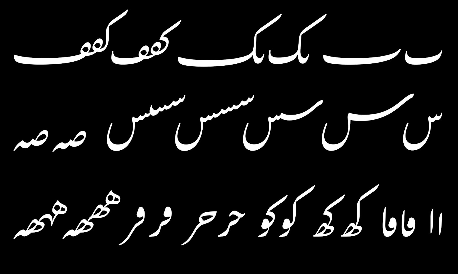
Fig 9. Various contextual alternates and elongated forms in Gulzar.
تصویر ۹۔ گلزار میں حروف کی متبادل اور کشیدہ صورتوں کی چند مثالیں۔
Other potential expansions of the project will include an optical size axis and a bold style to provide a better text hierarchy where required. Currently, Gulzar fully supports Arabic, Persian and Urdu languages and, hopefully, future updates will include wider support for other languages which use the Arabic script.
پروجیکٹ کے دیگر ممکنہ اضافوں میں ایک آپٹیکل سائز ایکسِس (optical size axis) اور بولڈ وزن شامل ہوں گے تاکہ حسبِ ضرورت متن کے مختلف حصوں کے معنوی فرق کو واضح کیا جا سکے۔ فیالحال گلزار میں عربی، فارسی اور اردو زبانوں کی مکمل سپّورٹ موجود ہے، اور امید ہے کہ مستقبل میں عربی خط کو استعمال کرنے والی دیگر زبانوں کی سپّورٹ بھی شامل ہو گی۔
This project's aim is to contribute to a better representation of Arabic-script writing styles across different platforms. It is not only a new typeface but offers a novel approach in designing typefaces that are designed to accurately represent the script rules and push the boundaries of current text rendering technologies. Since this is an open source project, we encourage other designers and font-makers to adopt this method to create more typefaces based on their preferred stylistic expressions. We hope that this will be a turning point in designing Arabic-script typefaces which are not limited by Latin-script-oriented typesetting technologies, but which promote a more inclusive and diverse approach in typeface design.
اس پروجیکٹ کا مقصد یہ ہے کہ مختلف پلیٹفارمز پر عربی رسم الخط کے اسلوب کی بہتر ترجمانی میں حصہ ڈالا جائے۔ یہ نہ صرف ایک نیا ٹائپ فیس ہے، بلکہ دیگر ٹائپ فیسز کو، جو اپنے رسم الخط کے قواعد کی درست ترجمانی کرتے ہیں اور موجودہ ٹیکسٹ رینڈرنگ ٹیکنالوجیز کی حدود کو آزماتے ہیں، ڈیزائن کرنے کا ایک نیا ڈھنگ بھی پیش کرتا ہے۔ یہ ایک آزاد مصدر پروجیکٹ ہے، اور ہم اس بات کی حوصلہ افزائی کرتے ہیں کہ دیگر ڈیزائنرز اور فونٹ بنانے والے بھی اپنے ٹائپ فیسز تخلیق کرنے اور اپنے فن کا اظہار کرنے کے لیے گلزار میں موجود طریقے اپنائیں۔ ہم امید کرتے ہیں کہ یہ پروجیکٹ عربی رسم الخط کے ڈیزائن میں ایک نیا موڑ ثابت ہو گا، اور ایسے ٹائپ فیسز کی تخلیق میں مددگار ہو گا جو ٹائپسیٹنگ ٹیکنالوجیز کی لاطینی حدود سے باہر قدم نکالیں گے، اور جو ٹائپ فیس ڈیزائن میں ایک جامع اور متنوع نقطۂ نظر کو فروغ دیں گے۔
Engineering of Gulzar
گلزار کی انجینئرنگ
Engineering a Nastal’iq font with OpenType technology was a huge challenge. The first stages involved understanding the scope of the problem and examining existing approaches, notably that of Noto Nastaliq Urdu, as well as the patent documenting the technology behind Linotype Qalmi. But while we adopted some elements from both of these projects - Qalmi’s system of contextual substitution, and Noto’s decomposition of characters into rasm and nukte - ultimately we needed to develop many of our own techniques.
اوپن ٹائپ ٹیکنالوجی میں نستعلیق فونٹ کو تیار کرنا ایک عظیم چیلنج تھا۔ ابتدائی مراحل میں ہم نے مسئلے کے سکوپ کا اندازہ لگایا اور موجودہ پروجیکٹس کا جائزہ لیا، جن میں خاص طور پر نوٹو نستعلیق اردو، اور لائنوٹائپ قلمی کی ٹیکنالوجی کے پیٹنٹ کا مطالعہ کیا۔ ہم نے ان دونوں پروجیکٹس کے کچھ پہلوؤں کو اپنایا بھی — قلمی کے سیاقی متبادلات کا نظام، اور نوٹو میں حروف کو رسم اور نقطوں میں جدا کرنے کا طریقہ — لیکن بالآخر ہمیں اپنے طور پر ہی ٹیکنالوجیز کو تیار کرنے کی ضرورت پیش آئی۔
Indeed, the Gulzar project birthed a number of new technologies, without which it would not have been possible to achieve the result we wanted: first, the FEZ language was created as a more flexible and programmable alternative to Adobe’s feature language; the Crowbar OpenType debugger was invaluable in tracing the complex interactions between layout rules; a new collision detection library, Collidoscope, was written to help inform the dot positioning algorithm; and a new font QA approach based on test-driven design was developed to ensure that development did not cause regressions to desired behaviour.
درحقیقیت، گلزار پروجیکٹ نے متعدد نئی ٹیکنالوجیز کو جنم دیا، جن کے بغیر ہمارے مطلوبہ نتائج کا حصول ممکن نہ تھا: اول، FEZ زبان ، جو اڈوب کی فیچر زبان کا مزید لچکدار اور پروگرامنگ کے لیے زیادہ موزوں متبادل ہے؛ Crowbar اوپن ٹائپ ڈیبگر، جو لےآؤٹ کے اصولوں کی جانچ پڑتال کے لیے انمول ثابت ہوا؛ ٹکراؤ کی نشاندہی کرنے کے لیے ایک نئی لائبریری، Collidoscope ، جس نے نقطوں کی جگہ متعین کرنے والے الگورتھم کو لکھنے میں معاونت کی؛اور فونٹ کے معیار کو پرکھنے کے لیے ٹسٹس پر مبنی ڈیزائن (test-driven design)، تاکہ اس بات کو یقینی بنایا جا سکے کہ نئی تبدیلیوں کی وجہ سے فونٹ میں درست کی جانے والی پرانی غلطیاں دوبارہ نمودار نہ ہوں۔
With contextual glyph substitution and decomposition in place, the major engineering requirements of a Nastal’iq design are the correct placement of dots; achieving tight but even fitting; and the special handling of certain characters which impact upon text to their right (particular baṛī ye, but also final jim, ain, and choti ye).
گلفس کی سیاقی تبدیلی اور حروف کو ان کے عناصر میں جدا کر لینے کے بعد نستعلیق کی اگلی اہم ضروریات یہ ہیں: نقطوں کی درست تعیناتی؛ حروف یا الفاظ کے درمیان چست لیکن متوازن فاصلہ، یا فِٹنگ (fitting)؛ اور کچھ ایسے حروف کا خصوصی برتاؤ جو اپنی دائیں جانب موجود متن پر اثر انداز ہوتے ہیں (خصوصاً بڑی ے، لیکن آخر میں آنے والے ج، ع، اور چھوٹی ی بھی)۔
In Gulzar, dot placement and fitting are intertwined; dots are first placed using mark positioning as normal, but special consideration is given to the interaction between the final character in one sequence and the initial character of the next sequence at a particular height, with a set of contextual rules determining the correct placement of dots at these interactions. (See red arrows in figure 10.) Finally, an exhaustive search is used to determine situations where dots in their natural placement would collide, and in these situations the dots are moved to second or third alternate anchor positions. (See green arrow.)
گلزار میں نقطوں کی جگہ کے تعین اور فِٹنگ کا ایک دوسرے سے گہرا تعلق ہے؛ پہلے قدم پر نقطوں کو عمومی مارک پوزیشننگ (mark positioning) کے ذریعے بٹھایا جاتا ہے، لیکن پیوستہ حروف کے ہر سلسلے کے آخری کیریکٹر اور اگلے سلسلے کے پہلے کیریکٹر کے باہمی تعلق کو بھی خاص طور پر اہمیت دی جاتی ہے، اور ایسی جگہوں پر سیاقی اصولوں کے ذریعے نقطوں کی درست جگہ کا تعین کیا جاتا ہے۔ (تصویر ۱۰ میں سرخ تِیروں کو دیکھیے۔) آخر میں، ایک مفصل تلاش کے ذریعے ایسی صورتوں کا پتہ چلایا جاتا ہے جہاں نقطے اپنی قدرتی جگہوں پر بھی دوسری اشکال کے ساتھ ٹکرا رہے ہوں، اور ایسے نقطوں کو ان کی دوسری یا تیسری متبادل جگہ پر منتقل کیا جاتا ہے۔ (ہرے تِیر کو دیکھیے۔)
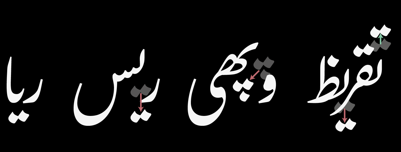
Fig 10. Height-dependent contextual dot repositioning, as well as collision avoidance.
تصویر ۱۰۔ اونچائی کی بنیاد پر نقاط کی جگہ کا تعین، اور دیگر اشکال کے ساتھ ٹکراؤ سے اجتناب۔
Tight fitting is achieved through an automated approach which determines the correct spacing between the final character of a sequence and the initial character of the next, with reference to the “height” of the following sequence.
چست فِٹنگ کے حصول کے لیے ایک خودکار نظام استعمال کیا گیا ہے جو پیوستہ حروف کے سلسلوں کے آخری کیریکٹر اور اگلے سلسلے کے پہلے کیریکٹر کے درمیان درست فاصلہ معلوم کرتا ہے، اور جس میں اگلے سلسلے کی ”اونچائی“ کو بھی مدِّ نظر رکھا جاتا ہے۔
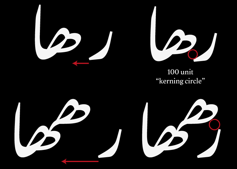
Fig 11. Applying a “kerning circle” to automatically determine correct distances at different heights.
تصویر ۱۱۔ ”کرننگ کے دائرے“ کو استعمال کرتے ہوئے مختلف اونچائیوں میں خودکار طریقے سے درست فاصلوں کی پیمائش۔
Special handling of baṛī ye and other sequences was achieved through a combination of techniques: substituting mark glyphs affected by the baṛī ye swash by unanchored variants allows them to be removed from the normal positioning system, and then a similar collision avoidance algorithm to that described above is applied to identify sequences which need to be repositioned (fig 12); for other glyphs which have smaller rightward strokes that only affect a single previous glyph, contextual positioning rules achieved the same objective.
بڑی ے اور اس کے متعلقہ سلسلوں کے لیے خصوصی طریقے استعمال کیے گئے:ایسے نقطوں یا اعراب کو، جو بڑی ے کے نچلے سٹروک کی زد میں آتے تھے، متبادل گلفس سے تبدیل کیا گیا تاکہ وہ جگہ متعین کرنے کے عمومی نظام کا حصہ نہ بنیں، اور پھر ان کو بالا میں بیان کیے گئے ٹکراؤ سے بچانے کے الگورتھم سے ملتے جلتے الگورتھم سے گزار کر درست جگہوں پر منتقل کیا گیا (تصویر ۱۲)؛ دیگر گلفس جن کے دائیں جانب مُڑنے والے چھوٹے سٹروکس محض پچھلے حرف پر اثرانداز ہوتے تھے، ان کو سیاقی اصولوں کے ذریعے برتا گیا۔
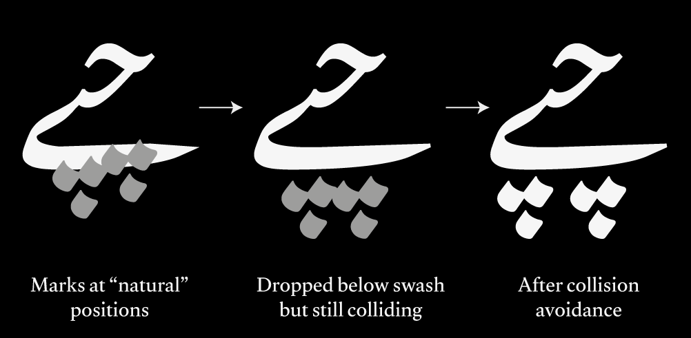
Fig 12. Handling the baṛī ye sequence
تصویر ۱۲۔ بڑی ے کے سلسلے کے ساتھ برتاؤ
Overall, the combination of these techniques provides a tighter fitting and more natural layout than other Nastal’iq OpenType fonts, at the cost of considerable technological complexity - at many points during the development of the font, the font refused to compile due to the large number of contextual rules! However, we found ways to compact the layout in order to provide both a performant and aesthetically pleasing result.
مجموعی طور پر،ان تمام ترکیبوں کے امتزاج سے دیگر نستعلیق اوپن ٹائپ فونٹس کے مقابلے میں بہتر فِٹنگ اور رواں لےآؤٹ حاصل ہوتا ہے، لیکن اس کی قیمت قابلِ ذکر تکنیکی پیچیدگیوں کی صورت میں چکانی پڑتی ہے: فونٹ کی تیاری کے دوران کئی مرتبہ ایسا ہوا کہ سیاقی اصولوں کی بھرمار کی وجہ سے فونٹ نے کمپائل ہونے سے ہی انکار کر دیا! چنانچہ ہم نے لےآؤٹ کو مختصر کرنے کے طریقے بھی ڈھونڈے تاکہ ایک ایسا نتیجہ حاصل ہو سکے جس میں تکنیکی کارکردگی اور جمالیاتی نفاست دونوں موجود ہوں۔
As an open source project which we hope will be a basis for others to develop their own fonts, we have made it a priority to document and explain Gulzar’s engineering processes; you can read more of the technical details behind how the engineering works in this document and the annotated source files containing the layout rules.
ہم امید کرتے ہیں کہ ایک آزاد مصدر پروجیکٹ کے طور پر گلزار دوسروں کے فونٹس تخلیق کرنے کی بنیاد بھی بنے گا، اور ہم نے اس بات کو ترجیح دی ہے کہ اس کی انجیںئرنگ کے عمل کو تفصیل سے قلمبند کیا جائے؛ آپ اس کی انجینئرنگ کی مزید تکنیکی تفصیلات اس دستاویز میں اور لےآؤٹ اصولوں کی سورس فائلز میں (مع تشریح) ملاحظہ کر سکتے ہیں۔
Credits
کریڈٹس
Gulzar is funded by Google and released under the SIL Open Font Licence.
گلزار کو گوگل کی طرف سے مالی اعانت فراہم کی گئی ہے اور اسے SIL اوپن فونٹ لائسنس کے تحت جاری کیا گیا ہے۔
- Borna Izadpanah (Principal Designer and Project Leader)
- Simon Cozens (Font Engineering)
- Alice Savoie (Designer, Gulzar Latin)
- Fiona Ross (Consultant, Gulzar Urdu)
- Amir Mahdi Moslehi (Calligraphic adviser, Gulzar Urdu)
- Martin Dodds (Consultant, Gulzar Urdu)
- برنا ایزدپناه: پرنسپل ڈیزائنر اور پروجیکٹ لیڈر
- سائمن کزنز: فونٹ انجینئرنگ
- ایلس سیووئی: ڈیزائنر، گلزار لاطینی
- فیونا راس: کنسلٹنٹ، گلزار اردو
- امیر مهدی مصلحی: خطاطی کے مشیر، گلزار اردو
- مارٹن ڈوڈز: کنسلٹنٹ، گلزار اردو

Thanks
شکریہ
Our team would like to thank Dave Crossland and Chris Simpkins for making this project possible. We are also grateful to those who generously helped us by testing various versions of Gulzar and gave us extremely useful feedback. In particular Awais Athar, Bahman Eslami, Abeera Kamran, Pasha M. Khan, Damoon Khanjanzadeh, Saadat Mateen and Adil Soomro. We extend our gratitude to those who are still reviewing the design and look forward to receiving their feedback.
ہماری ٹیم اس پروجیکٹ کو ممکن بنانے کے لیے ڈیو کراسلینڈ اور کرِس سِمپکِنز کا شکریہ ادا کرنا چاہے گی۔ ہم ان لوگوں کے بھی شکرگزار ہیں جنہوں نے فراخدلی سے گلزار کے مختلف ورژن جانچ کر ہماری مدد کی اور ہمیں انتہائی مفید رائے دی۔ خاص طور پر اویس اطہر، بهمن اسلامی، عبیرہ کامران، پاشا ایم خان، دامون خانجانزاده، سعادت متین اور عادل سومرو۔ ہم ان لوگوں کا شکریہ ادا کرتے ہیں جو اب بھی ڈیزائن کا جائزہ لے رہے ہیں، اور ہم ان کی رائے کے منتظر ہیں۔
Reporting issues
مسائل کی اطلاع دینا
Although a substantial amount of work has gone into producing the best possible result when typesetting with Gulzar and avoiding clashes, at this point in time it is extremely difficult to produce an OpenType Nasta’liq typeface that can automatically anticipate every possible letter combination and render them correctly. Therefore, there might be instances where certain sequences are not correctly displayed. In this case, we invite users to report such issues or any other problem that they may encounter on GitHub, and we will do our best to address them. We are aware of the lack of proper support for typefaces like Gulzar on platforms such as Adobe InDesign and Illustrator. However, the latest version of Photoshop (thanks to the implementation of HarfBuzz) correctly displays Gulzar, and we believe that other Adobe applications will soon follow suit. (See tracking issue.)
گلزار میں ٹائپسیٹنگ کا بہترین ممکنہ نتیجہ حاصل کرنے اور مسائل سے بچاؤ کے سلسلے میں کافی کام کیا گیا ہے، لیکن فیالوقت ایک ایسا اوپن ٹائپ نستعلیق فونٹ تیار کرنا انتہائی مشکل ہے جو حروف کے تمام کمبینیشنز کو درست طریقے سے رینڈر کر سکتا ہو۔ لہٰذا، آپ کو ایسے الفاظ کا سامنا کرنا پڑ سکتا ہے جو درست ظاہر نہ ہو رہے ہوں۔ ایسی صورت میں ہم صارفین کو دعوت دیتے ہیں کہ وہ ایسے یا کسی بھی دیگر مسائل کی اطلاع گِٹہب پر دیں، اور ہم ان سے نمٹنے کی پوری کوشش کریں گے۔ ہم اڈوب اِنڈیزائن اور السٹریٹر جیسے پلیٹفارمز پر گلزار جیسے ٹائپ فیسز کی مناسب سپّورٹ کی کمی سے واقف ہیں۔ تاہم فوٹوشاپ کا تازہ ترین ورژن (حرفباز کے نفاذ کی بدولت) گلزار کو درست رینڈر کرتا ہے، اور ہم سمجھتے ہیں کہ دیگر اڈوب ایپلکیشنز بھی جلد ہی اس کی پیروی کریں گی۔ (ٹریکنگ کا ایشو دیکھیے۔)
To report an issue or to make a request for enhancements, please visit the issue tracker on GitHub. To file a new issue, you will need to create a GitHub account and log in. You will then be able to use the green button on the right ("New issue") to file an issue.
کسی بھی مسئلے کی اطلاع دینے یا بہتری کی تجاویز پیش کرنے کے لیے براہِ کرم گِٹہب پر موجود ایشو ٹریکر کا دورہ کیجیے۔ نیا ایشو کھولنے کے لیے آپ کو ایک گِٹہب اکاؤنٹ کی ضرورت ہو گی۔ لاگ اِن کرنے کے بعد آپ دائیں جانب موجود ہرے بٹن (”New issue“) کو استعمال کر کے نیا ایشو کھول سکتے ہیں۔